Cover Version

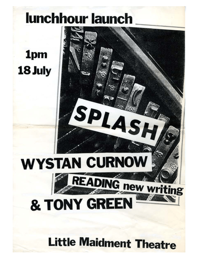
Small Bore Book’s forthcoming title, Imogen, by Joanna Margaret Paul, is a tribute to the close collaboration between the author and printer Alan Loney.

Loney, who founded and operated the Hawk Press (1975–83), the Black Light Press (1987–91), the Holloway Press (1994–98) at Auckland University, and Electio Editions (2004–) in Melbourne, is a crucial figure in New Zealand book-making, both as a printer and writer. Noel Waite describes him in the National Grid as “one of New Zealand’s best exponents of open form poetry, a private press printer of international repute and an uncompromising postmodernist practitioner.”

arab_treadle
Alan Loney printing at Hawk Press, Taylors Mistake, 1976. Photo by Robin Neate

 The short life and death of her second daughter in 1976 led Joanna to compose a book-length waiata tangi – part poetic lament, part celebration. Her words not only conveyed a heart-felt meaning, they also described very specific shapes on the page, where the white spaces could be as telling as the letters. Expressing that complexity and fluidity within the rigid framework of letterpress type forms was Alan Loney’s challenge. Ours was to honour his solution.

IMG-0796.JPG
Cover of Imogen designed by Alan Loney. Hawk Press edition 1978

An identical reprint of Imogen is impossible. A copy of the first edition could be scanned and reprinted, but the results of that facsimile process can be overtly archival and strangely lifeless. Instead, Small Bore Books put the text through a contemporary version of the book making process with the aim of producing a new arrangement of an admired original.

The Hawk Press edition used cases and cases of the Centaur typeface, which has since been digitally recut and can be googled and downloaded in minutes. In the printed text, subtle differences in the letterforms can be seen, but their spirit abides. With a steel ruler and a lot of pixel-by-pixel nudging, the digital type has been sized and located into a not quite note for note interpretation of the original performance. Some alignments have altered. The weight is more even and the grid’s tempo a little stricter. There is no ink to soak softly into the page. Toner sits sharply on white paper.

IMG-0798.JPG
Imogen, Joanna Margaret Paul. Hawk Press edition 1978.

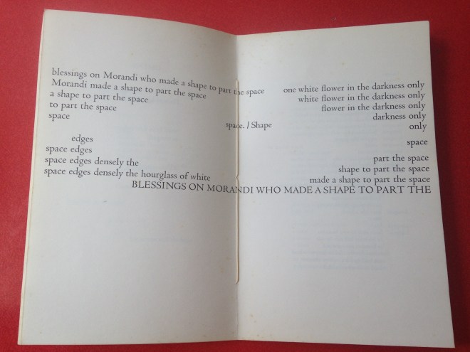
In a 2016 interview with Robert Wood in Cordite Poetry Review, Alan Loney talked about letters and spaces. “To effect a word-space in letterpress printing is to insert a piece of metal, a shank made of lead, after the end of a word and before the next word starts… In a page of type, the space at the end of a paragraph is a row of lead spaces from the end of the sentence to the end of the paragraph line. And the irregular spaces at the ends of unjustified lines… are all rows of irregular metal spaces. When the type is ‘locked up’ or held together in the press for printing, the overall shape of all the metal, letters, punctuation marks and spaces, has to be a close to perfect rectangle of metal, a shape which might bear little relation to the actual shape of the words as they will appear on the page.” 

The letters, shanks, formes, quoins and chases which Loney locked into a back-to-front positive of Imogen are all dispersed and gone now. Perhaps it would be possible to reassemble them – to get the band back together – but we have chosen to start afresh with this cover version. And, fittingly, the book’s cover is a key part of the story. Printer Brendan O’Brien of Fernbank Studio worked closely with Joanna on a number of her later books and has designed and printed a new cover for this edition of Imogen. His process? Letterpress, exactly as practised by Loney and generations of printers before him. The cover is also hand stitched, just like the 1978 edition.

Imogen 2019 Small Bore Books
Cover of Imogen designed by Brendan O’Brien at Fernbank Studio. Small Bore Books edition 2020.

The new technologies do not point towards the extinction of the old or the eclipse of their values. Loney himself says, “I still make books in exactly the same way I did before the computer entered my life. But a number of other printers, particularly in the United States and Germany, have learned well how to add contemporary laser, computer and digital technologies to traditional technologies in the making of specific books. And I do believe it is the conjunction of the traditional and the contemporary that has the greatest chance of preserving the art/craft of the book, acknowledging its 2000-year history as what gives us leave to even think about the word ‘book’ in the first place.”

 – Frank Stark, Editor, Small Bore Books 

Note: A descriptive bibliography of Alan Loney’s printed books will be published by Opifex Books later this year.


Advertisement

From Splash

As the cheese ad says, good things take time. Our latest venture was 31 years in the making.

We’re delighted to have worked with Wystan Curnow, Phil Dadson and Te Uru to produce the lost issue of Splash, originally intended for publication in 1987.

Splash was a journal edited by Wystan Curnow, Roger Horrocks, Tony Green and Judi Stout and produced “unofficially” through the English department of Auckland University. Four issues were released between 1984 – 1986.  The title Splash came from the film of the same name, staring Daryl Hannah and Tom Hanks, paid homage to by issue two’s cover.

Splash Two.jpg

Contributors were asked to send submissions typed in courier font. The cover was printed externally, but the editorial team copied the content themselves (back to that “unofficial” support) and held stapling working bees to assemble them. 400 copies an issue were produced: photocopiers had made independent publishing accessible.

Splash was run alongside And, another Auckland University guerrilla publication, edited by Leigh Davis and Alex Calder with Roger Horrocks, between 1983 – 1985. Reflecting on it last year Wystan Curnow described it as “And was the theory magazine. Splash the practice magazine”.

Screen Shot 2018-05-21 at 12.16.34 PM.png
Poster for poetry reading and launch of Splash no. 1, Wystan Curnow and Tony Green, University of Auckland, 18 July 1984 sourced Thomasin Sleigh

Critical acknowledgement of Splash‘s short but important role in NZ’s art and literary history is sparse, but Thomasin Sleigh writes insightfully about Splash and And in her master’s thesis on Wystan’s writing. 

These writers and critics were not only interested in the praxis of Language poetry but … armed with new models of critical theory and post-structural thought, and had aspirations to see what could come out of the application of these new frameworks for art and literature in New Zealand. …these journals aimed to be provisional in form but provocative in content; to disrupt the epistemologies of poetry in New Zealand and posit innovative alternatives. – Thomasin Sleigh 2010

Splash #4 was released in April 1986, and included an article on From Scratch by Tony Green and a note signalling the upcoming issue #5:

We had originally decided to include a wider range of From Scratch material in #4, but the project kept on growing — to the point where we decided it would be better to devote virtually the whole of an issue to From Scratch, doing the job properly. It’s a job that (surprisingly) no one else has yet done — documenting the work and ideas of one of New Zealand’s most original music/visual arts performance groups…

Work and life got in the way and the anticipated issue was prepared but never printed. In 2017 Andrew Clifford invited Small Bore Books to work with From Scratch’s Phil Dadson and Splash‘s Wystan Curnow to finally bring the issue to fruition. We were delighted and honoured to take up the challenge.

Most of the archival material was held as part of the From Scratch Records at the currently under threat Elam Library, Auckland University.

In the printery 2

Wystan and Phil painstakingly checked various draft texts held in the archive to ensure the right material. The only corrections made were minor editorial tweaks of spelling and punctuation. Our Splash is the 2018 model, using contemporary technology but on a production scale equivalent to the original Splash. The cover is an affectionate update of the intended 1987 cover, keeping that funky 80’s vibe.

splash cover concept

Splash Five 1987 From Scratch Special Issue: 2018 is launching at Te Uru this Saturday and Frank will be taking part in a panel discussion at the Auckland Art Fair this Sunday. See us there, or order your copy now.

Emma Bugden, Editor 


It’s all geek to me

When asked to detail the Small Bore Books production process – not that often to be honest – we sometimes refer to ourselves as post-digital digital publishers. We use domestic computer technology to produce those most quintessentially analogue of objects – limited edition books.

The SBB workflow is quite straightforward. All of the published texts to date have come to us as print manuscripts – letterpress, laser printer and Gestetner documents. Via manual transcription or translation of PDF documents they have been converted into text files for editing and proof reading. We use a somewhat outdated version of Apple’s Pages (Pages 09) for page layout because of its pagination and type features – still unmatched by the latest versions – and appropriately enough we run it on a comfortably middle-aged Mac Mini. The production team dread the day when some part of this combo becomes too ancient to maintain and we will have to indenture ourselves to InDesign or some other Adobe product.

The real heart of the printery is the Fuji Xerox SC 2020 printer. Its manufacturers think of it as an office workhorse, or in the words of the brochure, “a multifunction printer targeted at the Small to Medium-scale Enterprise (SME) market” but it has some hidden qualities. Thanks to something called a Current Confinement Self-Scanning Light Emitting Device (based on another Xerox technology called the Vertical Cavity Surface Emitting Laser) it produces very high resolution type (2400×1200 dpi) at a respectable speed (up to 20ppm) on both sides of paper weighing up to 250 grammes per square metre. It also scans documents quite nicely and possibly sends faxes in its spare time.

IMG_5772
The printery

For Black and / or White and Julian Dashper: Untitled CV the SC2020 was also used to produce the covers on A3 card. A more ambitious design brief for New Zealand Potter: a partial archive led to a relationship with Whanganui designer Joseph Salmon. His cover, with a selection of images referencing the original publication and a woodblock rendering of the title, was produced by Perry Print who have also been responsible for the binding of all our books. In the first two, the original typefaces and layouts were reproduced digitally – a kind of reconstructed facsimile. For NZ Potter, which featured a mixture of typewriter fonts in its early years, a new style was developed using a combination of Univers and Gill Sans on the entirely unscientific basis that if you like Bernard Leech, you probably like Eric Gill. In no way can Joe be blamed for that choice or any other aspects of the book’s interior design. We are excited by the Great Leap Forward in shelf appeal brought about by his cover.

IMG_5771
New Zealand Potter wood-cut by Joseph Salmon

New Zealand Potter is also the first SBB title to use the SC2020’s colour capability. Aside from the sharp increase in costs for the four-colour toner and a significant slowing of output, the results have passed quality control. On review, it is possible that the accounts department will determine that this is an area for budgetary caution. Nevertheless, as with all three SBB publications to date, the book demonstrates that in limited editions our particular medium-tech, low-rent approach to publishing actually works.

IMG-0256
New Zealand Potter: a partial archive

Over the last two decades, the disruptive proliferation of low-cost digital tools has all but wiped out formerly lucrative enterprises like recording studios, photographic laboratories, typesetters and video post-production houses. At the same time the expectation has grown that the world wide web and electronic books would do the same to publishing. But it turns out that books and Kindles are not the same thing. Just as people find value in vinyl pressings of music recorded on ProTools or in movies edited on laptops, it seems they are going to fill their coffee tables and shelves with books made of paper for years yet.

Frank Stark, SBB Editor 

Three polaroids and a tape deck: Julian Dashper’s CV

unt ints_0
Julian Dashper, Untitled (Interviews) 2001-02, still from a double DVD in an edition of three. Image sourced from Circuit.

Julian Dashper’s work Untitled (CV), various dates, presents the artist’s curriculum vitae,  updated each time his work is exhibited. The artwork continues Julian’s interest in the support structures that scaffold the art world; the mechanisms for framing, documenting and publicising art. Like much of Julian’s work it’s serious even when humorous.

A cv is a statement about an artist’s career. There’s jostling for attention early on and  more strategic positioning once established. But working on our upcoming book of the cv, Julian Dashper Untitled CV, I’m struck afresh by the generosity of Julian’s practice, continuing to exhibit in artist-run spaces throughout his career to encourage new generations of artists. In the documentary Julian Dashper My Space Julian, talking about the often elusive nature of his work, says jokingly, “every time you make an exhibition you lose a friend”. Yet the reverse was true, his cv charts the growing networks he built, first in Auckland then nationally then overseas, from New York to Amsterdam.

Now, almost 10 years after his death in 2009, the cv resonates differently, as a stand-in for the artist, a posthumous portrait. I’ve come to understand each entry as a capsule, the container for a variety of social encounters, from the exhibition install to the opening discussions and the post-opening dinner.

Untitled (Black CV) 1999, still from a DVD in an edition of 3_520
Julian Dashper, Untitled (Black CV) 1999, still from a DVD in an edition of 3. Image sourced from Circuit.

Certain entries stand out: for Frank, my co-editor, there’s Julian’s first ever solo exhibition, Motorway Schools, at 100m2 in 1980, the gallery founded and run by Frank in Auckland. He recalls, “Julian was one of the catalysts for starting the gallery. He had formed a kind of duo of expressionist enfants terrible at art school with Julian Hanson – the Juliano Brothers – and I got used to seeing both of them splash a lot of messy paint about. Julian D’s was the first solo show scheduled. I should have realised that things were going in an unexpected direction when he asked me to go down to the bush below the Elam buildings one night to help him record the white noise of cars whooshing by. On installation day he turned up with three polaroids and a tape deck.”

motorway03
Motorway Schools, Julian Dashper, 100m2, 1980

For myself, the 1997 entry reading “The Honeymoon Suite, Dunedin” is particularly special, as it was the first time I exhibited Julian’s work, at the artist-run space that Jonathan Nicol, Warren Olds and I ran. Julian was the most established artist we’d shown and we were beside ourselves with excitement when he made contact. His warmth, professionalism and kindness at what was really a rather ad hoc venture have remained with me since as an exemplar.

In making a posthumous book we’ve had to make decisions about what Julian would have wanted and we’re immensely grateful to Marie Shannon and the Julian Dashper Estate not just for allowing us to work with the material but for steering us in these decisions. Thanks also to Michael Lett for his support.

20905665_1979046048997700_8125800432921477120_n
Pages stacking up in the printery, ready to be made into books

Julian Dashper Untitled CV will be launched in early September at SPRING 1883 in conjunction with a Julian Dashper project by Michael Lett.  Following that, we will hold an Auckland book launch. Please email me at emma.bugden[at]gmail.com if you would like to be added to the invite list or to pre-order the book.

Emma Bugden, SBB Editor 


Judging the Portage Ceramics Awards

FOR IMMEDIATE RELEASE: 21 July 2017

Emma Bugden photo
Portage Ceramic Awards 2017 judge Emma Bugden

New Zealand curator announced to judge 2017 national pottery awards

For the first time in its now 17 year history, a New Zealander has been appointed to judge the Portage Ceramic Awards, Aotearoa’s best-known survey of contemporary ceramic activity. Whanganui-based curator and writer, Emma Bugden, will select finalists and winners for this prestigious event, organised and hosted each year by Te Uru in Titirangi with support from The Trusts Commumnity Foundation.

Bugden was previously Senior Curator at The Dowse Art Museum, where she curated many ceramics exhibitions including Slip Cast, A Modest Modernism: Roy Cowan & Juliet Peter, Holding Holes: Lauren Winstone and the nationally touring exhibition, His Own Steam: A Barry Brickell Survey, co-curated with David Craig with an accompanying book from AUP.

Her initial training was in ceramics through the Craft Design Diploma at Northland Polytechnic where she studied until transferring to a fine art degree, giving her a distinctive perspective across the art and craft sectors.

Currently, as co-founder and editor of Small Bore Books, Bugden is working on A Partial Archive of New Zealand Potter (1958 – 1967), an anthology of the early years of New Zealand Potter magazine.

“I’m excited by the recent upsurge of interest in ceramics, nationally and internationally,” says Bugden. “Over the last few years we’ve seen new work in clay by established potters and by artists developing a ceramics language in a visual arts context. I think each has rejuvenated the other.”

“The Portage Ceramic Awards are at the heart of it, so I’m delighted and honoured to be this year’s judge. The stellar line up of former winners bears testament to its importance as a definer of excellence and a launching pad for the future.”

Established in 2001, the Portage Ceramic Awards is a hallmark event for the New Zealand ceramics community, showcasing some of the best work currently being made, and serving as a platform for dialogue about developments in the ceramics field. Whether emerging or senior, artists have the opportunity to receive the premier award of $15,000, merit awards, or a residency at the prestigious Guldagergaard International Ceramic Research Center in Denmark, all selected by this year’s judge.

“The awards exhibition is shaped by the views of each years’ judge,” says Te Uru Director, Andrew Clifford, recalling the variety of highly respected international experts that have overseen the previous 16 events. “The unique perspective that each judge has brought to the country has helped to keep the event fresh and keep us all on our toes. But this year we wanted to try something different and see how it would work with somebody who has a closer understanding of local contexts in Aotearoa, but will still be able to offer fresh insights. We are certain that Bugden will make a fascinating and rigorous contribution to the event.”

___


Entries are now open for New Zealand’s premier ceramic event – The Portage Ceramic Awards – which this year will be judged by Emma Bugden.

Artists can submit digital images of their work to the awards at: http://www.teuru.org.nz/portage. Entries close on 7 August.

The selection of finalist works for the 2017 Portage Ceramic Awards is a two-stage process. Approximately sixty works will be selected by the judge from submitted photographs. Shortlisted artists will be invited to send their works to Te Uru for final selection, where the judge will view and choose the exhibiting works and award winners.

The Awards’ finalists will be announced on 28 October.

This year’s prize selection includes a residency to participate in a workshop programme
at Guldagergaard International Ceramic Research Center. Guldagergaard provides state-of-the-art facilities, and encourages dialogue and the exchange of knowledge, ideas and research about materials and techniques.

“The opportunity for this sort of international experience is invaluable to practitioners at any level”, says Clifford. “As New Zealand’s leading national ceramic event, it’s important that the Portage Ceramic Awards can help build international profile and networks for the New Zealand ceramics community.”

The premier award winner, Guldagergaard residency winner, and up to three merit award winners will be announced at a ceremony to be held at Te Uru Waitakere Contemporary Gallery in Titirangi, West Auckland on Thursday 9 November.

The finalist works will be exhibited at Te Uru Waitakere Contemporary Gallery from 10 November 2017 – 11 February 2018.

Full entry details and criteria can be found at http://www.teuru.org.nz/portage
For an interview with Emma Bugden, or for further information please contact:

(09) 818 8087 info@teuru.org.nz http://www.teuru.org.nz

[ENDS]

___

NOTES TO EDITORS:

About Emma Bugden:

Emma Bugden is a curator and writer based in New Zealand. She is Co-founder and Editor of Small Bore Books, a specialist art and design publisher dedicated to connecting historic texts with new audiences. http://www.smallborebooks.com. Bugden has held curatorial roles in New Zealand including Senior Curator at The Dowse Art Museum, Director of ARTSPACE and Curatorial Director at Te Tuhi Centre for the Arts.

She has a distinctive perspective on both contemporary art and craft, having started out training in ceramics through the Craft Design Diploma at Northland Polytechnic before transferring to art school. While at The Dowse Art Museum, she curated many ceramics exhibitions including Slip Cast, A Modest Modernism: Roy Cowan & Juliet Peter, Holding Holes: Lauren Winstone and the nationally touring exhibition, His Own Steam: A Barry Brickell Survey, co-curated with David Craig with an accompanying book from AUP.

At Small Bore Books, she is currently working on A Partial Archive of New Zealand Potter (1958 – 1967), an anthology of the early years of New Zealand Potter magazine. She has also written for numerous art publications and catalogues, including artist monographs on Suji Park, Michel Tuffery, Saskia Leek and Sean Kerr. Bugden was a Juror for the 2016 Walters Prize at Auckland Art Gallery, and is Judge for the upcoming 2017 Rotorua Museum Art Awards.

About the Portage Ceramic Awards:

Established in 2001, the annual Portage Ceramic Awards is New Zealand’s premier showcase for ceramic arts. Administered by Te Uru Waitakere Contemporary Gallery with support from The Trusts Community Foundation, the awards are the country’s best-known barometer for developments in the field of ceramics.

The premier Portage Ceramic Award carries a prize of $15,000. Up to three merit awards totaling $3000 are also on offer. This year’s prize selection includes a residency at Guldagergaard International Ceramic Research Centre in Denmark. The overall winners will be announced at a ceremony to be held at Te Uru on 9 November 2017.

About Te Uru:

Te Uru Waitakere Contemporary Gallery, based in scenic Titirangi, is West Auckland’s regional art gallery. After two years of redevelopment, Te Uru opened in November 2014 in a purpose-built building as part of the Lopdell Precinct. Te Uru receives core funding from the Waitakere Ranges Local Board of Auckland Council.


Small Bore Books Workshop

We’ve been a bit quiet lately, working away on several upcoming books. But also, working away on the Small Bore Books workshop. No longer are we are a (spare) bedroom press. We have our very own printery in a converted garage.

DSC_3346

Stationery is stored in old display shelving which originally came from Londontown, an iconic Whanganui department store in Victoria Street open for business from 1928-1989. Our printer, for the train spotters amongst you, is a Xerox SC2020. We were going to give it a name, but nothing would come to mind. It’s not the most romantic looking tool and it doesn’t give off satisfying inky smells, but it gives us independence – control over what and how we print.

IMG_5124 (1)

I wonder if this set of drawers originally displayed haberdashery? Now they contain paper and other items a publisher needs to hand, including a rather large collection of marker pens.

Although this is where printing and compiling of books happens, we have a separate office (housed in a circular water tank) for copy editing and correspondence.

Emma Bugden, SBB Editor 

“We have to know about our histories. It’s only polite.”

Last weekend I was lucky enough to attend a ceramics hui in Auckland. Set up by Humphrey Tait at Creative New Zealand and facilitated by Anna Miles, the hui was a day of talking and thinking in a room packed with makers, gallerists, curators and collectors. What are the pressing issues facing ceramics today? Turned out there were many as the animated and at times feisty exchange took shape.

IMG_20170429_161203

Small Bore Books was invited because we’re working on an anthology of the early years of New Zealand Potter. A Partial Archive of New Zealand Potter (1958 – 1967) will be launched later this year at Objectspace. The book mines the idealism and innovation of the 1950s and 1960s as the first makers and writers developed a ceramic language for New Zealand.

So I was particularly interested in debates about the gaps and erasures in craft history today, noticeable both in the scarcity of critical writing and in the difficulties of learning craft history with the demise of the polytech craft programmes. Instead, and excitingly, ceramics is a new feature of visual arts programmes, but largely stripped of its connection to craft tradition.

IMG_20170429_161308
Cheryl Lucas, Moyra Elliott and Isobel Thom

As ceramics writer Moyra Elliot said in the morning session “We have to know about our histories. It’s only polite.” The Dowse Art Museum’s Director Courtney Johnston pointed out “the applied arts does not feature in our history”, describing her experience of studying art history at Victoria University, but was optimistic, declaring “we’re in a shift at the moment” and “it’s very non-bleak right now”. Indeed there was much to celebrate, as pottery clubs described an unprecedented level of interest in beginner classes (largely due to telly’s Great Pottery Throwdown) and many speakers highlighted the growing presence of craft in our public galleries. Andrew Clifford, Director of Te Uru, suggested that public galleries are, by default, writing craft histories, highlighting “what’s old that we need to be reminded of”.

Artist Lauren Winstone got me excited when she described her fantasy craft institution as “a bicultural bauhaus – rich in cultural awareness, playful and questioning and rigorous in practice”. I immediately wanted to sign up. Later in the day Carla Ruka gently pointed out that many of the elements on our growing wishlist were already practiced by the 30 year-old collective Nga Kaihanga Uku with a kaupapa that includes the wonderful directive of “learning as a family” and ensuring that members always brought into the fold new students to be mentored.

There were many discussions and questions I’ve left out of this account. It was a day of  aspiration and debate (as Kim Paton said, “communities are never unified”) which reminded me, yet again, of the importance of sitting together and talking.

Emma Bugden, SBB Editor 

The thingness of things: an interview with Mary-Louise Browne

Small Bore Books recently asked Mary-Louise Browne some questions.
3848
Mary-Louise Browne

SSB: Black and/or White was your masters submission at the Elam School of Fine Arts in 1982. What kinds of artwork were you making prior to this? 

MLB: I began to be drawn away from the pictorial by throwing myself into installation at art school. I used to set up big low lying installations on pallet like floors with plants emerging out of them or sand gardens, and then give the audience a hint of what I was up to through the titles. I remember one title distinctly “Lucian did not plant the accidental rose”. I engraved this on a small white marble plaque and put it in the gully outside Elam and told people where to find it. It looked quite funereal and I think people thought I had buried a pet. I have always liked these misinterpretations.

The installation work I did was about making people wade their way through at knee level, for instance the foyer outside the library at Elam  – the work spread out from the front door of the building to the front door of the library to the door to the corridor to the teachers tea room. It wasn’t intimidating so much as irritating. I didn’t want to make single perpendicular sculptures, I was interested in making works more supine, the difference between male and female art.

PCL8543-02
Beyond the Pale, Mary-Louise Browne, 100m2, 1980

SBB: What led you to using text?

MLB: I started to think about how the title of the work might just be enough to get people thinking about the concept, picturing the work and that perhaps the actual work wasn’t necessary, just the proposition. I am still interested in this notion, in fact my most recent exhibition Picturing is a good example of this. The plaques could well be labels.

Then of course I got interested in performance because of its temporal nature and in those days any work that actually existed as an object was seen to be too commercial and that didn’t interest us in the sculpture department at Elam. After all we were being taught by Phil Dadson. These performances whose residues  became installations, (as you can see in those photos from 100m2), were still temporal and the content was political, or  gender political.

Working Conditions_ANZART Hobart_1983
Working Conditions, Mary-Louise Browne, ANZART, Hobart, 1983


PCL8543-07
Rebus, Mary-Louise Browne, 100m2, 1980

However in spite of this I know that I still liked the ‘thinginess of things’ and these handset letterpress texts are permanent works on paper which satisfies this urge to make ‘things’ and have a document of what was going on at the time. The late Philippe Hamilton described these texts in a review in Craccum as a kind of ‘navel gazing’ however, and I am sure many people agreed.

Rebus 1980 100m2
Rebus, Mary-Louise Browne, 100m2, 1980

 SBB: How does it feel to revisit this work, over 30 years later?

 MLB: When I look back at the work I feel exactly the same way I did then, and given the kinds of responses I got back then, I must have had repressed memory syndrome which has now ‘recovered’. This mainly because the the situation hasn’t really changed for me personally but I do think that the situation has changed for some women artists, especially women who do not make overtly political work. Moving image as a medium has certainly helped women artists exist on a more level playing field. Photography has shifted from a predominantly male domain too.

Truly Rural_Knox Church_Art in Dunedin 1984
Truly Rural, Mary-Louise Browne, Knox Church, Art in Dunedin, 1984

Black and/or White

Tomorrow night we’re officially launching our first title, Black and/or White by Auckland artist Mary-Louise Browne. This book is a new iteration of a text work first made in 1982, as a student at Elam School of Fine Arts.

IMG_3950-3
Emma compiling the printed pages of the new iteration of Black and/or White.

Known now for her large word sculptures, by 1982 Mary-Louise had already begun a text practice. In her hands words become slippery and mutable, undermining our expectations of narrative resolution.

Black and/or White contains 17 individual stories, each one offering three or four possible endings. The stories weave across each other, at times contradicting and negating each other. They are hilarious and yet also confronting. When I first read them I assumed they were fiction, but many of the artworks described are real. Reading them now, I think about feminism at the height of postmodernism, with authorship itself under threat.

IMG_20160417_212601
Checking the facsimile copy against the original text.

Black and/or White was presented as a loose leaf boxed set – a book without a spine. It was printed at Elam on a letterpress printer, handset in Univers medium type. Mary-Louise printed it with the help of legendary Elam print technician Robin Lush, whose role in the practice of art books is talked about here in a lovely blog post by the Elam Library.

Our 2016 version is digitally printed, carefully reproduced from the original. We have taken great care to ensure that it’s a faithful copy, while wanting to acknowledge its difference from the original.

IMG_20160421_093239

Like Mary-Louise’s first version, this iteration has been handmade, apart from the one stage of the process we can’t yet produce in-house. Instead, I took it down to Bill at Perry Print for binding.

Screen Shot 2016-06-14 at 9.04.01 pm

To get your hands on a copy of the book please send an email to emma.bugden@gmail.com. Black and/or White retails for $30 (plus postage), and is a limited edition of 100.

Emma Bugden, Editor 


Melbourne Art Book Fair

The Small Bore Books squad travelled to Melbourne in early May to investigate and play a small part in the second annual Melbourne Art Book Fair hosted by the National Gallery of Victoria.

IMG_3986

It was exciting to be in a room full of publishers, from the large and established to the small and specialist, and heartening to see how many people visited (and bought books!) over the weekend.

There were some familiar names in the mix,

IMG_3993

including, funnily enough, my own.

IMG_3994-2

We were interested to check the fair out, as we’re keen to hold a stall ourselves in the future. I also spoke about Small Bore Books on a panel as part of the fair’s public programme, thanks to our friends at 3ply.

The panel was a chance to articulate some of the ideas we’re mulling over, about what it means to republish the past, to insert a text back into circulation. We do this because we’re interested in hearing the original voice, again. While the copy emulates the original, it is a new work that has a dialogue with the original, and we want to be honest about that shift. We see the new iteration as a pointer back to the original, rather than an improvement or an update. It’s certainly not 2.0.

IMG_4001

Melbourne was stimulating and gave us plenty to think about, and to aim for.

Emma Bugden, Editor